Also known as "UX" (User eXperience), though since modern UX seems to mean "remove all the features and hide all the buttons in a menu and follow the latest crappy design trend that makes the user experience worse", I consider them different.
This is a list of some qualities and features that I think all good software should strive for. They're not things that you absolutely need to do and I probably won't appear behind your window at night if you don't. It's more like: if there was a perfect piece of software, these are some of the things it would do. Always look up towards things you could do better instead of making excuses for why they don't really matter.
This list is not at all exhaustive and will be expanded whenever I feel like it. There's probably things that are so obvious that I don't even realize they should be mentioned, for example showing tooltips when you hover over things that aren't self-explanatory.
Above each subtitle is a "category" that the topic belongs to.
UI / visual / organization
Separate different types of elements clearly
The user shouldn't get confused about where the buttons are and what is a button in the first place. "Modern" design trends tell you to remove everything from buttons except the text/icon; just make it float in a flat background. That kind of buttons work ok in some contexts, for example when there's a list of iconic buttons and they are very isolated from other things, so it's not always bad, but in many situations this makes it harder to tell what things are the buttons.
Crappy buttons:
Actual buttons:
Furthermore a button should look like a button, a toggle should look like a toggle, a dropdown box shouldn't look like a text input. Buttons and toggles in particular are often hard to tell apart.
Another thing that "modern design" wants you to do is remove colors and turn everything into flat icons. This may look stylish in some sense, but it reduces your ability to recognize and locate things at a glance. Take for instance the toolbars in graphics editors, Affinity Photo uses colored icons, while Photoshop uses flat single color icons, the tools in AP are much more recognizeable and easier to find:
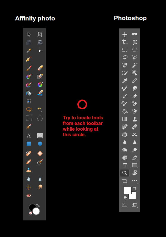
Also worth noting that the tools in AP are roughly coordinated by color and shapes; many color placement tools are sky blue, selection tools have thin silver spots, text tools use a flat bright gray color, patching tools use an orange bandage color, brush/drawing tools are diagonal towards bottom-left... Using colors gives you more ways to coordinate relations between different things.
UI / design
"Gray out" inputs that are unavailable (as opposed to hiding them completely)
Hiding inputs is confusing because as a user you look for the input, but you can't tell if you opened the wrong menu or if you're just not seeing it or if it's hidden. But if it's grayed out then you can find it immediately, and being grayed out signals to you that the input unavailable at the current time.
Architecture
As small as possible
Mostly in terms of not having unnecessary components such as libraries and systems that aren't necessary. They make the executable bigger and slower, often causes bugs and degenerations and even limitations because you as a developer don't know exactly how something works or it doesn't do exactly what you want, and may be slower than you realize.
Most modern websites load a ridiculous amount of garbage despite the website not doing anything very special. As far as I know this is because they're made by using huge frameworks and tools instead of the page templates and scripts being written by hand.
The text tool in Krita seems to have been made by plugging in some crappy XML editor, and I think this is most likely the reason why it has had so many issues and weird formatting bugs and general clumsiness, and now years later the whole tool seems practically abandoned. It's simply not as easy to modify and control some external system, as it is to modify a text editing system that you made yourself for your own purpose.
Game engines tend to inject a lot of unnecessary things into most videogames because the engine is designed to be more generic than specific, so even a simple 2D game may end up being 100s of megabytes.
A more esoteric thing to note is that when you make something yourself, you put more thought into how to make it good. If you use someone else's system, then your primary goal is to get that system to work, not to design that system to best suit your own purpose.
Architecture
No additional dependencies
If the user has to install another thing to use your program (for example use another web browser for your site, or download some .NET framework or additional library something), or enable javascript to click a link in your website, it's just making it harder and less convenient to use it. There's no reason the program can't just be downloaded and launched without any additional steps.
The same applies to open source software. Being able to just download and compile it is infinitely better than having to start downloading/learning dependencies and build systems.
Websites should aim to work without Javascript, there are many people who disable it either for privacy reasons, paranoia, or just to reduce bloat on the web. Javascript can be added on top for more/better functionality, but it shouldn't be required.
This is probably a more debatable opinion, but I think installers are included in this. I don't want an installer to put files everywhere and leave god knows what in all kinds of folders and download additional things that I didn't consent to downloading. Just give me a zip with the program in it. I don't think installers are bad per se, since it will make the program easier to use for someone who's not technically savvy or very particular about their files. But for me who is both of those things, there's nothing more satisfying about downloading a new program than when it's immediately usable as soon as I download it. At the very least a portable version should be provided as an alternative.
Organization / design
Requires as few clicks as possible
An example of the opposite of this is putting actions in menus under other menus under other menus under other menus. For example in order to download an image from the email program I used at work, I had to click 4 or 5 times instead of just doing a regular "right click save as". It was extremely annoying to receive files through email because of that.
Another example would be that in order to "nudge" a layer (move it by 1 pixel with arrow keys) in GIMP, you have to click the canvas after selecting a layer. It seems like nothing but it's a huge quality of life problem to someone who's proficient at using the program and just wants to precisely tweak the positions of some layers. That is FAR from being the only quality of life problem in GIMP though.
MS Paint lets you crop the canvas simply by dragging a handle in the corner, no need to open some kind of crop menu. You can move something on the canvas simply by selecting it and then moving it, no need to switch between different tools or enable transform mode or cut/paste or anything of the like. Photoshop also lets you move things on the canvas by Ctrl+Clicking and dragging the selection, having many features in your program is not an excuse to put basic functionality behind menus and extra steps.
Architecture
Starts up instantly
MS Paint is one of my most frequently used programs, and I think it is partly because the program starts up instantly. It is so quick to open it up and start doing stuff that I don't even need to think about it.
One of my most frequently started up videogames is Noita because I can launch the game and start a new run literally within 5 seconds of having the thought. It is so effortless and fast to get into a game that I don't even need to make a decision, I just have to click it when I feel like I might want to play.
There's no reason for almost any program to not start up instantaneously. Even a videogame can load the start menu instantly (unless it shows in-engine scenes or gameplay in it), and then load the rest of the game content in the background. Especially most assets like graphics and sounds do not need to be loaded at startup.
If the program needs to do additional loading before something can be done, for example all the game content hasn't loaded yet, then a loading screen should appear after clicking the start button.
Even a seemingly huge program like Photoshop has no reason it can't just load the UI instantly and let you configure a new canvas while it loads more features and fonts and whatever it spends so god damn long on. It's almost as if there's a conspiracy to make all 2D graphics programs take forever to boot up for no good reason.
Obviously you need to actually make different components of the program dynamically loadable, so you can't just change any existing program to start instantly, you have to architect it smartly to begin with.
This could be greatly aided with metaprogramming that lets you do some of the initial setup when you compile the program rather than when the program is started by the user. Unfortunately most languages have very poor metaprogramming capabilities and don't make it easy to do this. But there may be hope in the future with programming languages like Jai.
Systems design
Responds to input instantly
For example when you click a button, it should show a response or result or open something instantly. If it can't show the real content/result instantly, then show some kind of a loading icon, the important thing is to confirm to the user that the click was successful.
Be careful though: it is extremely annoying if a loading screen pops up and you can't close it, so you're forced to sit there watching it load (even if that click was a mistake). I'm looking at you, Adobe.
Mentality / design
Functionality first
With as little unnecessary fluff as possible.
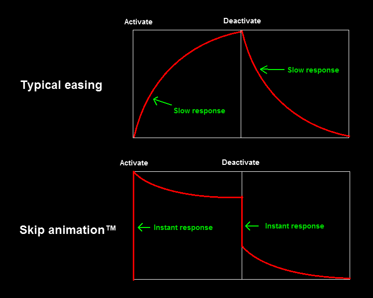
An example of unnecessary fluff are excessive transition animations. A little bit of animation can be informative and clarifying to the user, but if you have to wait a whole second for a menu to open just because it's playing an animation, it gets in the way of the functionality of that menu. Even very short animations can be intrusive if the user needs to go through them constantly or very quickly.
An example of this problem is hover animations, if you have a big list of buttons and the reaction to your cursor is slow, it lowers your perception of what your mouse is hovering over. Try to move your cursor quickly left and right across these buttons, the second list may not be as "fancy", but it feels a lot more responsive to your cursor and satisfying to interact with, while the first list almost feels like it's resisting and doesn't want you to click them:
These Animations Are Too Slow
These Feel Much More Responsive
The good news is that you can have both animation and responsiveness by animating multiple parts, and making at least one of them instant:
Eat Cake And Have It Too
Another approach could be to change how you interpolate by skipping forward in the animation.
Try it yourself:
An unrelated functionality-first point is to make the program go straight to the screen where you can use it, without requiring the user to set things up.
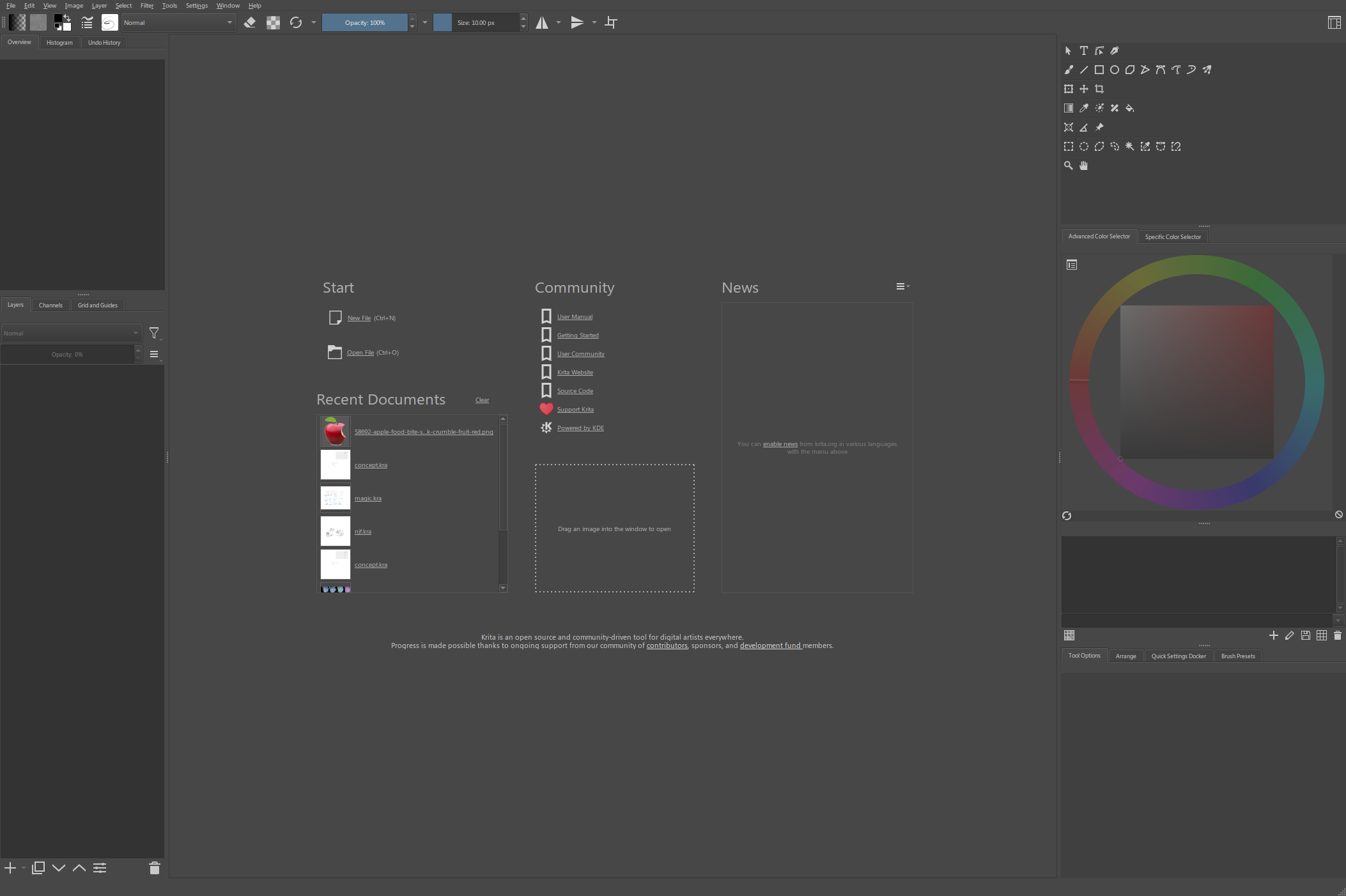
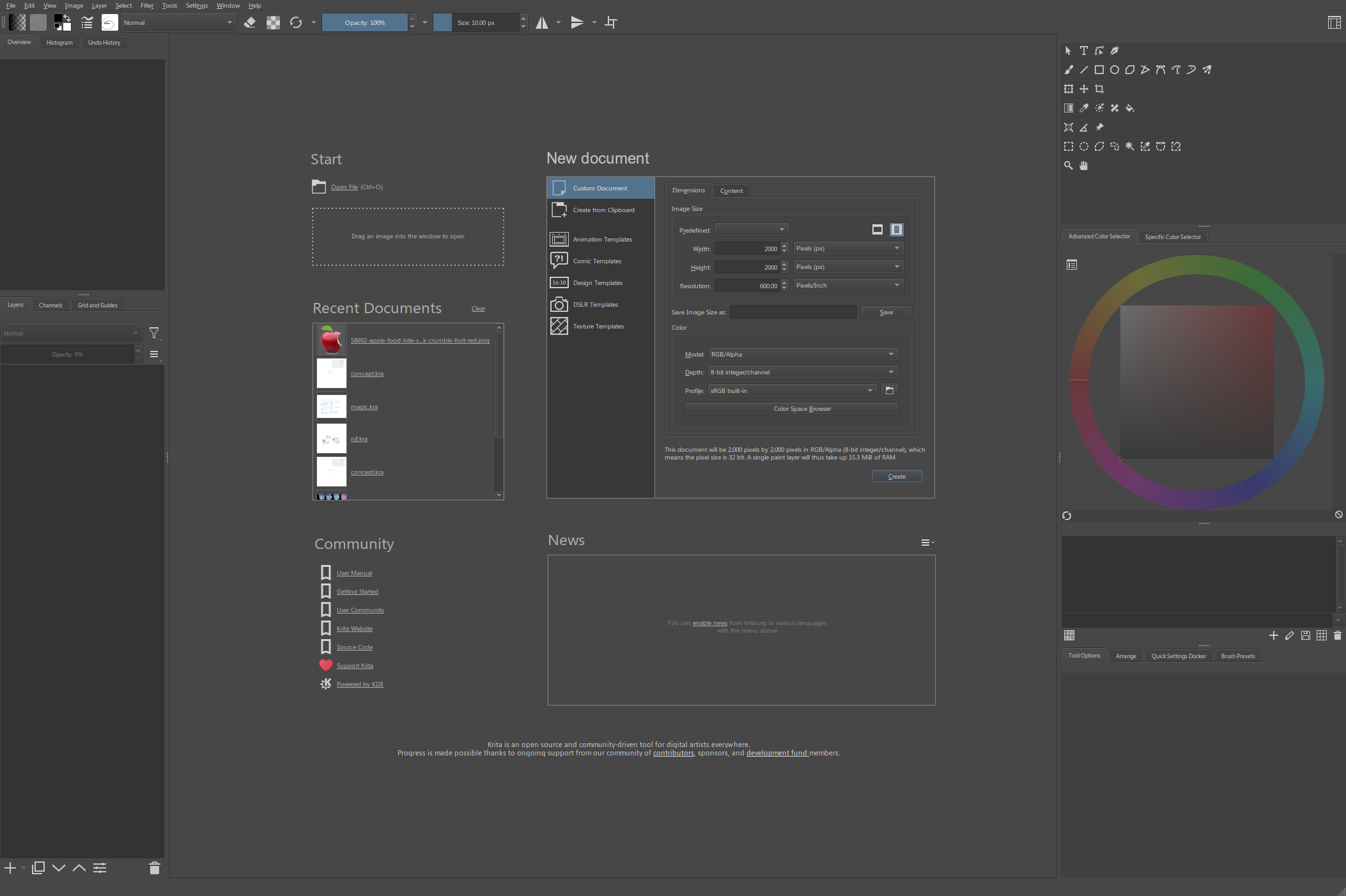
For example when you open MS Paint, it automatically opens a new canvas for you, while Photoshop requires you to go to a menu just to open the new canvas configuration screen. Krita is slighly better than Photoshop since it shows some buttons and recent documents in that empty space, but it would be even better if the "new document" options were also there. Put a scrollbar onto it if you need to, scrolling it is still way better than having to go into some sub-menu window.
Update: Krita now uses most of that space to show your recently opened files, which is definitely an improvement. I'd still prefer some of that space to be used for the new document stuff though.
Organization
Configurations and saved data can be accessed as files
This is simply the easiest way to let the user backup and import/export their settings and presets. Bonus points if they're all in the same place with nothing else in it so the whole folder can be easily copy pasted.
For example Sublime Text has a folder where all of your configuration and theme files are. You can just throw them into a USB stick and put them into another computer to bring all your settings over.
Import/export buttons are fine, but having all the configs as files in a specific folder is better in my opinion because that way you don't require the program to get them, and can copy/paste/edit them with native operating system functions or even external programs.
This also lets you check/test the program in it's default configuration simply by temporarily renaming/moving the whole settings folder.
This includes anything that the program saves, including videogame save files. Even temporary cache files, having them in an easily accessible folder would make it much easier to clear any unnecessary or broken junk or possibly problem-causing files, or just to refresh the cache.
Dedication
As many settings as possible
You have your own opinion of how a certain thing should be, everyone does, and that's exactly the problem: everyone does.
A "famous" example would be TotalBiscuit always going straight to the settings screen to increase the field-of-view setting in games and complaining if it can't be made wide enough. Streamers usually enable subtitles in games because it helps viewers understand dialogue, but Jonathan Blow always disables them because it harms immersion and he thinks it's the audio's job to convey speech and the audio is badly designed if you need subtitles. There's one streamer I know of who disables speech completely in some games because he's a very methodological tinkerer and likes to play and think in his own ways and figure things out without help or interruption.
Everyone has their own reasons and preferences and little annoyances. There's many videogames where people have had to look for hidden config files or even use mods to configure settings because the settings screen isn't good enough.
To go above and beyond, software should be moddable with plugins and mods. There's lots of plugins for Photoshop that add new features, there's videogames that some people only play with mods because they don't like the base game. Minecraft certainly wouldn't be as big and long lived if it didn't have an enormous modding community that lets people customize the game and even turn it into a totally different kind of game.
That said, although mostly impossible, you should strive to make mods unnecessary. People shouldn't want to mod your UI or graphics, they should be so good that people can't think of any improvements. I think it is shameful that Photoshop's color selector is still so crappy that plugins do a far better job, if I were in charge of Photoshop I'd want to make an official color selector that can't be beaten with plugins. Or, since Adobe has infinite money, just buy the plugin or even hire the developer and make it official.
There's still reasons to support mods though, for example if you have a proprietary file format, you'd want to create plugins so other programs will support it, or to add something to a program that isn't being actively developed anymore. Videogames also can be customized to be different for the sake of variety or personal preferences, not just to be "better" or to fix problems.
If you were a rad programming god who doesn't follow any rules can do anything you want and make people cheer at the things you do, what would you do to your program?
Other disjointed notes
The more you have to think about doing something, the more it gets in your way of doing it. When I say that a program should start instantly, I'm not saying it because of some autistic demoscene assembly programmer elitist wankery, I'm saying it because it reduces your ability to do things. The longer I have to wait for the program to open, the more the thought process that led to opening it in the first place will fade away, it interrupts my thoughts and actions. When I want to select a font in modern Photoshop and click the text tool, the entire program freezes for a whole 5 seconds and interrupts what I was thinking about, and now the thought "how does it take so long to load a list of text" is mixed in my head along with the thing I was about to do.
The same applies even to small delays, even a tiny delay of 0.5 seconds where you expected there to be none can be like tossing a pea at your forehead. It doesn't hurt or physically affect you in any way but it throws off your thoughts and focus.
GIMP is the definitive example of getting this completely wrong. Everything that you want to do requires you to put too much thought and effort into doing it. Yes it has this feature and that feature, the problem is that those features are so clumsy to use that it constantly interrupts my thought process when I want to do something. You can learn it and it will get better with experience, yes, but why? Other programs require far less experience to do the same thing. Why must I dedicate parts of my limited human brain capacity to store information about the behavior and keyboard shortcuts of your dumb app just because you were too lazy to make it more naturally intuitive?
I heard long time ago that the reason Zbrush became popular was not because it had the best features, but because the features it had were much more comfortable to use than other programs. I don't do 3D myself so I can't tell how accurate that was, but a similar point was brought up by Casey Muratori. iPhone and Google Map didn't do anything new when they came out, the reason they became such huge hits was because they were so responsive to input and pleasant to use.
Some technically well made programs
Here's some programs that I think are well made. Note that they're not necessarily perfect, they don't necessarily do most of the things mentioned in this page, should not be looked at with a magnifying glass to learn "good design", and are not my recommendation to you. They're just programs that I find noticeably pleasant to use with very few complaints.
- File Pilot (file manager)
- Sublime Text (text editor)
- MS Paint (graphics editor)
- SunVox (audio creation program)
- GifCam (screen recorder)
- Noita (videogame)
People often make fun of MS Paint for being simplistic, but technically speaking it is a very well made program. It starts up instantaneously and even opens with a new blank canvas. Every action is instant, basic actions like cutting and pasting and cropping and flipping require the most minimal amount of steps to do. You can paste and drag/drop images and the canvas will change to accommodate it. Most of the tools are not anti-aliased so you can use paint bucket and transparent selections without it looking messed up despite lack of transparency. The only real problems (besides lack of more advanced features) is that you can't crop the canvas from the top or left sides, there's no hex color input, and you can't choose the interpolation mode for scaling (for example nearest neighbor).